Start with an undertone
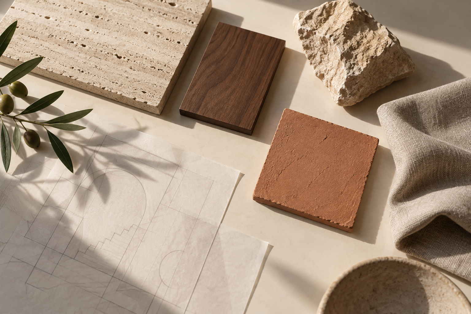
A useful starting point is the warmth or coolness shared by the main surfaces. A pale limestone, a warm oak and a natural linen can feel connected even when their textures are very different. The aim is a conversation between materials, not a perfect match.
Let texture create the variation
When color is restrained, texture becomes more noticeable. The grain of timber, the weave of fabric and the subtle movement in stone add interest without requiring a new color at every turn. Smooth and rough surfaces can work together to create depth.
Give contrast a purpose
A darker object or a sharper edge can help a quiet palette feel intentional. Use contrast where it clarifies a shape, anchors a room or frames a view. If every surface competes for attention, it becomes harder to see what matters.
Consider the everyday encounter
Materials are not only viewed in a finished photograph. They are touched, cleaned and lived with. Any real selection should take maintenance, suitability, availability and the setting into account alongside appearance.